The Great Precious Metals Market Disconnect that took place four years ago is now a ticking TIME BOMB. While the Fed and Central Banks have been relatively successful in propping up the broader stock, bond and real estate markets, time is not on their side. The more the highly inflated markets continue higher, the more breath-taking will be the inevitable collapse. The comments above and below are excerpts from an article by Steve St. Angelo(srsroccoreport.com) which has been edited ([ ]) and abridged (?) to provide a fast & easy read. Now, I am not just pandering hype here. There is plenty of data to support the evidence that the precious metals suffered a serious disconnect from the broader markets in 2012 and continue to be held down like a coiled spring. One of my readers forwarded me this excellent chart which shows this perfectly: 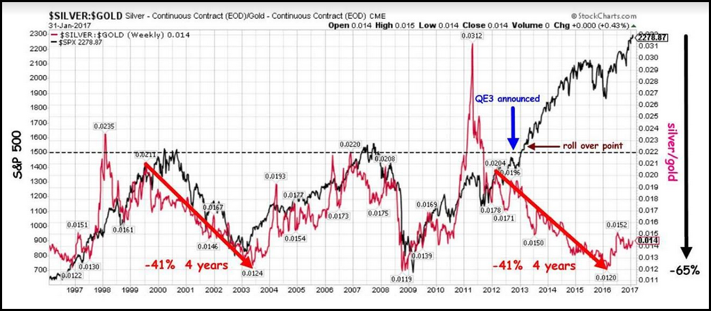
The chart is a Silver-Gold ratio (RED line) compared to the S&P 500 Index (BLACK line). Take note, this is not a Gold-Silver ratio, but the opposite. As we can see, the Silver-Gold ratio line has paralleled the S&P 500 from 1997 to 2012? very closely. However, when the Fed announced QE3 at the end of 2012, something quite interesting took place. The Silver-Gold ratio continued lower towards its bottom level, but the S&P 500 Index surged upward to a new record high. While many precious metals investors realize that this disconnect took place, this chart shows it with more precision. Furthermore, if we look on the right side of the chart we can see the percentage level of this disconnect is 65%. This is off definitely off the charts? literally and figuratively. Again, I appreciate my reader for forwarding this chart. After looking at this chart, I did some additional research on the S&P 500 and the silver price. If we look at the S&P 500 divided by the silver price since 1981, we have the following chart: 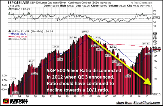
The current S&P 500 Index-Silver ratio is 130/1. Basically, 130 ounces of silver would buy the S&P 500 today. When silver reached nearly $50 in 2011, the S&P 500-Silver ratio was 28/1. However, if we go back to 1981 or in 1983, we can see the S&P 500-Silver ratio was 10/1. If we applied the same 1981 S&P 500-Silver ratio today, the price of silver would be $230. That being said, the value of the S&P 500 is severally inflated, so it is difficult to determine a realistic silver price based on a highly inflated stock index. Regardless, the YELLOW ARROW in the chart shows that the S&P500-Silver ratio should have continued lower, not higher towards the 130/1 ratio it is currently. Unfortunately, the precious metals were not allowed to be apart of this GREAT INFLATION because there just isn't enough physical metal to go around.. if the public started buying hand over fist. Win An iPad Pro! TalkMarkets.com is so convinced you'll love their website they are raffling off an iPad Pro to those who registers here by June 30, 2017. For more information please read the contest Terms and Conditions.800+ authors contribute to TalkMarkets.com so check it out, register here and then program the site to provide you with exactly what you want by topic and author.Market Volume Indicating Something Is Really Wrong With The Markets Not only have the precious metals disconnected from the broader stocks markets (shown in the first chart above), if we look at the volume at the S&P 500 and the silver price, we can spot another troubling sign: 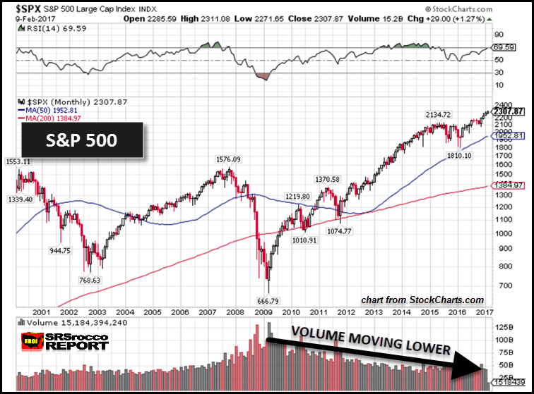
After the S&P 500 hit its low of 666 points in 2009, overall trading volume continued to decline. While I have mentioned this before in a previous article, I have looked at this trend in a different way. We must remember, a healthy stock or index rises along with its trading volume. This is precisely what took place with the S&P 500 from 2000-2009. However, the opposite has taken place since 2008-9, when the U.S. financial system suffered a severe heart-attack. Now, if we look at the Silver price chart, we see a much different picture: 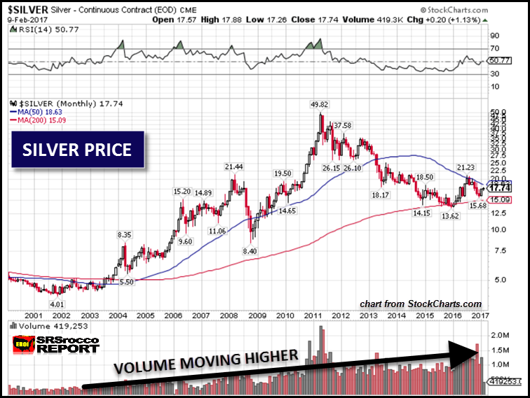
As the silver price trended higher since 2000, so did its trading volume. While its trading volume spiked in 2011 (along with the price) and the fell lower, its overall trend has been higher. Again, this is nothing new, but what I realized is this important factor: While the S&P 500 Index has been moving higher on a declining amount of trading volume, this has seriously INFLATED its true value. On the other hand, as the silver price has been moving lower or sideways as its trading volume has increased, its value has been severally DEFLATED. Basically, the S&P 500 Index is moving higher on lower and lower volume, thus INFLATING its value. Now compare that to the Silver price which is being DEFLATED by an increasing amount of paper trading contracts. Yes, it is true that a Future's Market was designed to properly hedge producers and buyers of commodities, metals and energy. However, gold and silver do not behave like most commodities that are consumed. Gold and silver also perform as monetary assets or stores of value. By increasing the paper trading volume of gold or silver, it diminishes its role as a monetary or store of value asset. Of course, this is being done on purpose. While the Fed and Central Banks continue to prop up the broader stock, bond and real estate markets with money printing, debt and derivatives, the ENERGY that they are relying upon to continue BUSINESS AS USUAL, is in serious trouble. The Great Precious Metals Market disconnect is a ticking TIME BOMB. Even though it is impossible to forecast when the bomb will go off, logic suggests the S&P 500 will head LOWER, while the price of silver (and gold) will head HIGHER. If you want more articles like the one above: LIKE us on Facebook; ?Follow the munKNEE? on Twitter or register to receive our FREE tri-weekly newsletter (see sample here , sign up in top right hand corner).
The post S&P 500/Silver Ratio Suggests S&P 500 To Head LOWER & Silver (and gold) HIGHER appeared first on munKNEE dot.com. |