This post My #1 Lesson for Stock Analysis appeared first on Daily Reckoning. I typically base my investment recommendations on fundamental measures. For example, I favor companies that have solid earnings, long dividend histories, and reasonable valuations. At the same time, there's one more thing I do before I make any final decision ? and that's look at the investment's chart. Yes, there was a time earlier in my career when I completely dismissed charts and all related technical measures as pure voodoo. However, after watching things for 20 years, I recognize chart analysis for what it really is: An immediate look into the recent history of a given investment or market. Charts represent the wisdom (or stupidity) of many thousands of individual investors all wrapped up in a single picture. And by overlaying some very basic technical measures, charts can help determine favorable points at which to buy or sell. Now? Are charts foolproof? Absolutely not! Nor do I think they should be the primary determinant of any action you decide to take. But at the very least, they often become self-fulfilling prophecies… and they can give us good information about where major levels of support and resistance reside. For example, take a look at this recent chart of gold? 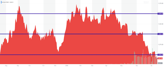
As you can see, I drew a couple horizontal lines on the chart. The first one from the top is right near $1,350 (the yellow metal's per-ounce price). You'll notice that this level was right about where gold previously topped out going into the fall of last year. You'll also see that once it went a bit above that level it crashed down to the $1,300 level represented by the next blue horizontal line down the chain. Then, after playing around that price for the rest of the year it pretty much plunged down another 50 points to just above $1,250 and quickly bounced back straight up to that $1350 level once again. Since the beginning of this summer, it's dropped back down in a very similar pattern to the one that took place last fall. Will the current $1,250 area hold as a new bottom? That's what the basic, big, thick line approach can't tell us. But the point of today's column is less about helping you time gold's next short-term move and more about understanding why charts can be helpful. Because the truth is that nearly any chart you look at will likely demonstrate the type of patterns of support and resistance that I just outlined for the yellow metal. And what's even more interesting is that these levels often revolve around big, whole numbers. A lot of folks would write this off as coincidence. But I attribute it more to human nature. After all, people draw lines in the sand like this all the time: Dow 10,000? oil at $100 a barrel? bitcoin at $6,000 and so on. Newspaper headlines and other media outlets also reinforce these kinds of numbers repeatedly. End result: These become natural places for people to stop, pause, and reconsider their investment theses (assuming they even had them in the first place). What's more, nobody likes taking a loss. So whenever you see a period of consolidation on a chart, it means a lot of transactions took place at that price level. This is precisely why the minute the same level is breached in the future, hordes of new sellers come out of the woodwork ? they simply don't want to watch their previous purchases go underwater! And that's how an area that was once support quickly becomes an area of resistance going forward. Now drawing these lines is more art than science, and there is always a little wiggle room in any given level of support or resistance. You can see that from my gold chart. For example, I could have easily added in $1,325 and $1,375 as well. Regardless, I think even the most conservative investor can learn a thing or two by pulling up a simple chart before they decide to pull the trigger. That's why I always look at a few charts ? over several different time horizons ? before I make any type of move with my own money or recommend any new action to readers. To a richer life, 
Nilus Mattive
Editor, Rich Life Roadmap The post My #1 Lesson for Stock Analysis appeared first on Daily Reckoning.  |